Friday, 9 March 2012

Progress

This is the second version of my double page spread for my magazine. I have completly changed the whole design of the magazine, I have simplified it and made it look cleaner and a lot more magazine styled rather than having a magazine that doesnt really fit in with the rest of the magazine. I have dedicated a whole page the article and the other page includes pictures of the band and the heading for the article split into four quadrants. This also goes with the Z format that is used in magazines. It allows you to focus on the text first and last with the pictures in between as well as allowing you to read the text first and then look at the pictures and vice versa. I still feel as if there could be a few more changes to this double page spread.
The contents page I have completly re-worked. My last contenets page was a double page spread, it was too spaced out and I wanted it more compact, more messy, more in the face. This contents page hasnt quite got there though. I feel as if it needs more text, maybe bigger lines, to make a statement about the magazine and also my designs and layouting. i am relly happy with my images though, i feel as if they give across their own style and own personality of who they are.

Friday, 2 March 2012

Progress

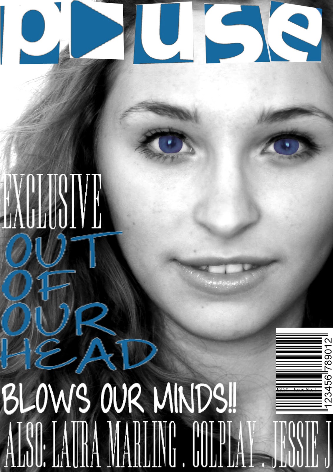
For this top magazine cover I have shrunk the text to make it smaller and resized the barcode. I have added a price and issue number for clarity. I have added more text at the bottom to make it seem more music styled magazine. i have changed the colouring of the header and the blue text to make it stand out a bit more. I have enhanced the eyes abit more and contrasted them with the background.  I have added in the names of the girls int he band on the front cover to allow the reader to identify the person on the front. I still think that there is something wrong with the cover, i believe that there is too much text at the bottom of the screen. This is making the magazine look more book like rather than a magazine that is fun and easy to read.  
I have changed the bottom of the page so there is less text and that the writing sits furthur down on the page. this then emphasises the eyes and the face which was the original intention. It appears to change the colours for all of the page and especially the tones on her face.

Thursday, 23 February 2012

Exam Board Examples Anaylsis

Supremacy
-Different types of shots: Mid shot, close up and long shot shows variety
-Almost appears to be a glamour magazine
-The shots taken are too posed for a muasic magazine, they need to be more relaxed
-Some pictures look like they were taken on a phone-blurry, crammed into one side of the photo
-No cropping or editing use as the pictures still have red eye
-Spelling mistakes
-She tried to make herself look more model like but failed
-The layouts are good but could of made some pictures bigger and strap lines smaller
-The article is clear to read
-The style of font and the colours used complement each other and the style of the magazine well
-Level 4, 52 marks
-Exam mark, 58

Drowned Insound
-Too posed photos
-Used both Mid and close up shots
-Could of got rid of the background to make image stand out more
-Smiley face in the corner?
-Yellow colour a bit tacky, although it is carried through to keep a theme, the pink used in the pages also clashes with the yellow
-The setting is good but boring
-Has resized and cropped the images
-The layouting is good but the colour scheme lets it down alot
-Font sizes- headers need to be made bigger
-Level3, 44 marks
-Exam mark, 52

Punky R 
-Boxes with image in it looks good
-Variety of different shots although they are repeated alot
-The colour scheme is good
-Could misinterpret the gender of the cover model due to editing
-Name of the person, should it be called Shiggy??
-Needs a prop or images of other bands to break it up and make it different
-No barcode or price or issue no. or tagline
-No setting
-Editing is OK, changed background and the styling
-Article- short and basic
-Spelling Mistakes
-Layout is good
-More on the contents page?
-Level 2, mark 26
-Exam mark, 22

Monday, 20 February 2012

Photos


Test Shots

These are my test shots, I have used both of my mosels in these to see how they would look seperate and also together. I took the photos on a plain white background so it would be easier to edit and cut out and place onto a different background. I will proberbly use something similar to these, and I will also change around the photo set up to have the models doing different poses under different amounts of lighting.


Thursday, 16 February 2012

Friday, 10 February 2012

Magazine Draft Article